A good wallpaper does more than fill a screen. It sets a mood every time you unlock your phone or open your laptop, and honestly, that tiny visual shift can make your device feel more personal in seconds.
For beginners, wallpaper design can seem oddly intimidating at first. Screen sizes vary. Icons cover part of the image. A photo that looks great on a monitor can feel cramped on a phone. Still, once you know a few ground rules, the process gets much easier, and a lot more fun.
Start With the Screen in Mind
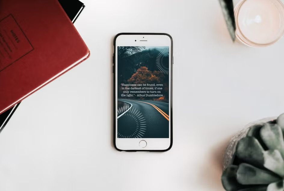
Before choosing colors, photos, or textures, focus on where the wallpaper will live. A simple wallpaper maker can make early sizing experiments easier when you are comparing phone and desktop layouts.
Phones and desktops behave differently. A phone wallpaper usually needs a stronger focal point, since the image is viewed vertically and partly covered by the clock, widgets, and app icons. A desktop wallpaper has more breathing room and often works better with wider compositions.
Here is a simple comparison:
| Device | Best Orientation | Main Design Concern | Safe Zone Tip |
| Phone | Vertical | Clock, widgets, app icons | Keep key subject near center or upper-middle |
| Desktop | Horizontal | Desktop icons, taskbar, dock | Leave one side or corners less busy |
| Tablet | Often vertical or horizontal | Mixed use, split-screen layouts | Use balanced spacing around focal point |
A beginner mistake shows up right here: designing one image and forcing it onto every device. You can do that, sure, though results are usually cleaner when you make one version for phone and another for desktop.
Pick a Clear Visual Direction
When people are new to wallpaper design, they often throw too much into one layout. A dramatic sky, big text, glowing shapes, heavy texture, five colors, maybe a quote too. That usually creates visual noise.
A wallpaper works best when the concept is simple and readable at a glance.
Good beginner-friendly directions include:
- Minimal gradients
- Nature photography
- Soft abstract shapes
- City scenes with negative space
- Clean geometric patterns
- Single-subject illustrations
- Mood-based color fields
Ask one basic question before you start: what should the eye notice first?
That answer becomes your anchor. Everything else supports it.
Use Size and Resolution Properly
A wallpaper that looks sharp on one screen can turn fuzzy on another if the file is too small. Start with enough resolution from the beginning.
A practical rule: design at or above the target screen size.
Common starting points:
Phone Wallpaper Sizes
- 1170 x 2532 for many modern smartphones
- 1080 x 2400 as a flexible general option
- 1440 x 3200 for higher-resolution devices
Desktop Wallpaper Sizes
- 1920 x 1080 for standard Full HD
- 2560 x 1440 for many larger monitors
- 3840 x 2160 for 4K screens
If you are unsure, go a little larger, then crop carefully. Going too small and stretching later usually wrecks image quality.
Build Around Safe Zones
Safe zones matter a lot, especially on phones.
Your wallpaper may look perfect in an editing window, then the clock lands right on someone’s face, or app icons cover the nicest part of the gradient. Annoying, yeah.
Think of wallpaper design the way you would think about body alignment in movement. In a good pilates routine, placement matters. Small shifts affect the whole experience. Wallpaper layout works the same way. A subject placed 2 inches too high or too low can change everything once interface elements appear.
Safe Zone Tips for Phone
- Avoid placing faces where the clock usually appears
- Keep text away from the top third
- Leave room around the edges for cropping
- Test lock screen and home screen separately
Safe Zone Tips for Desktop
- Leave one side calmer for icons
- Keep detail away from the taskbar area
- Avoid tiny focal points that get lost on large displays
Choose Colors That Work With Icons
Wallpaper design is not only about beauty. It also affects usability.
A bright, highly detailed background can make app labels hard to read. A dark wallpaper can look sleek, though some phones add white text over it more cleanly than others. Mid-tone images can work well too, as long as the icon area is not chaotic.
Here is a quick color guide:
| Color Style | Best For | Watch Out For |
| Dark tones | Minimal looks, OLED screens | Can feel muddy without contrast in shapes |
| Light tones | Clean, airy desktops | Icons and labels may lose clarity |
| Soft gradients | Modern, versatile use | Banding in low-quality exports |
| Bold colors | Creative, high-energy themes | Can overpower widgets and folders |
For beginners, muted colors are usually easier to manage than very saturated palettes.
Keep the Composition Simple
Wallpaper design needs restraint. A screen background gets viewed behind icons, notifications, widgets, browser windows, and folders. That means your image should leave room for daily use.
Good composition choices include:
Centered Subject
Useful for phones. A flower, silhouette, moon, or abstract shape in the center often survives cropping well.
Off-Center Subject With Empty Space
Great for desktops. Place the focal element on one side and leave the opposite side more open for icons.
Full-Frame Texture
Works on both formats when you want a mood, not a subject. Clouds, grain, paper texture, water ripples, fabric weave, or blurred lights can all work nicely.
Try not to cram the frame. Empty space is doing real work.
Photos Need Editing Before They Become Wallpapers
A phone snapshot rarely becomes a strong wallpaper without a few adjustments.
Even a nice photo may need:
- Cropping
- Brightness correction
- Shadow lifting
- Slight blur in busy areas
- Color toning
- Cleanup of distracting objects
For example, a street photo with neon signs may look exciting, though app icons can disappear against all that detail. In that case, lowering clarity a bit or adding a soft blur behind the icon zone can make the image much more usable.
Portrait photos can work too, though they need careful placement. Keep the face out of the widget zone and avoid tight crops that feel awkward once the screen trims the edges.
Add Text Sparingly, or Skip It
Quotes and words can be tempting. Most beginners want to add a phrase that feels personal.
Usually, less text works better. A wallpaper is not a poster. If you do add words, keep them short and place them where system elements will not cover them.
A good rule:
- 1 short phrase maximum
- Large enough to read
- Clean font, not decorative clutter
- Plenty of space around it
Honestly, many wallpapers look stronger with no text at all.
Make Separate Versions for Lock Screen and Home Screen
A smart beginner move is creating two related wallpapers instead of one all-purpose file.
Why? Because the lock screen often shows off the image, while the home screen has to share space with apps and folders.
A practical setup could look like:
- Lock screen: more detailed, more dramatic focal point
- Home screen: simpler version, softer background, less clutter
You can use the same image and make small changes, like adding blur, lowering contrast, or shifting the crop.
Export Cleanly and Test on the Actual Device
Never judge a wallpaper only on your editing canvas.
Export it, put it on the device, and test it in real conditions. Check it with dark mode, light mode, full brightness, low brightness, and a normal app layout.
Look for:
- Blurriness
- Bad crop placement
- Icon readability
- Overly sharp texture
- Weird color shift
- Hidden subject behind widgets
A wallpaper can feel perfect at 100% zoom on a computer and still look wrong once it is actually in use. Testing catches that fast.
Easy Starter Workflow for Beginners
If you want a simple method, use one like this:
Step 1: Pick One Image or One Idea
A mountain photo, a color gradient, a soft abstract shape, whatever fits your mood.
Step 2: Choose the Device
Phone first or desktop first. Avoid designing for both at the same time on your first try.
Step 3: Set the Correct Canvas Size
Use a resolution large enough for the screen.
Step 4: Crop for Safe Zones
Leave room for interface elements.
Step 5: Simplify
Remove clutter, lower noise, soften distractions.
Step 6: Export and Test
View it on the real device and adjust from there.
Final Thoughts
Wallpaper design gets better fast once you stop treating it like a giant art project and start treating it like screen-specific visual design. Focus on layout, safe zones, color control and clarity. Start simple. Make small adjustments. Test often.
After a few tries, you will notice something funny: the best wallpapers rarely look overworked. They feel balanced, easy on the eyes and right at home on the screen. That is the goal.


Leave a Reply